The Most Deceiving Chart for Stock Investors
We’ve all seen a chart that looks like this:

We’ve all seen a chart like this:
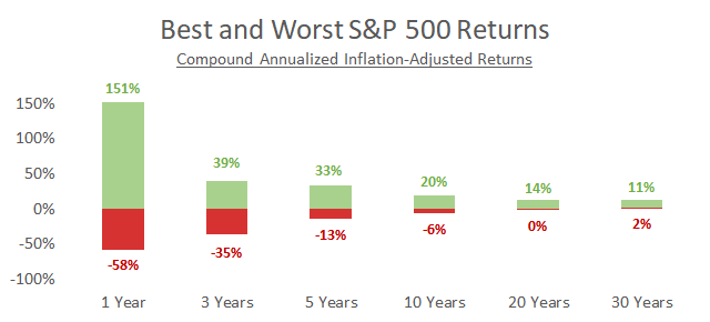
Most interpret it as meaning that the longer you own stocks the more average your return becomes.
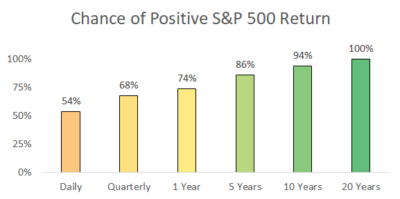
While the probability of losing money typically decreases the longer you invest…
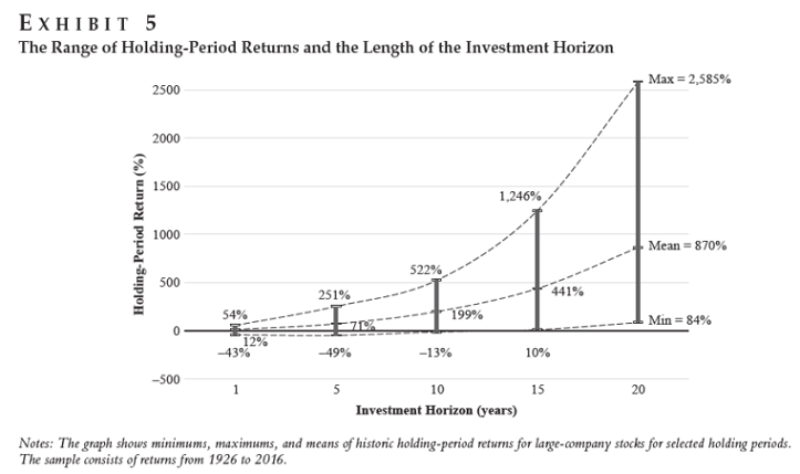
…the range of financial outcomes actually increases:
The Big Impact of Small Differences
Small return differences magnify over time. The long term narrowing of the original graph conceals a wide range of outcomes.
The graph below is based off of the same return data, but now shows the result of an initial $100,000 investment:
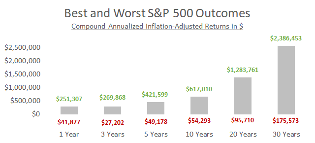
The bar to the far right shows that there’s been more than a $2 million difference in historical outcomes from the exact same investment.
Long-Term Return Outlook
Stock valuations and bond yields can tell us if future returns will likely be near the higher or lower end of historical ranges.
The graph below shows the relationship between starting valuations and yields (x-axis) compared to future returns (y-axis) of a portfolio 60% in U.S. stocks and 40% in 10-year Treasury bonds.
Basically, stocks are richly valued and/or bonds have low yields when dots are in the lower left.
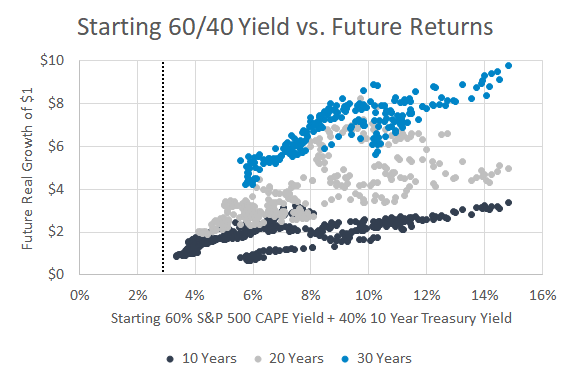
The dashed vertical line is where we currently stand.
As Jake at Econompic said, “time itself may not be a solution to the valuation challenge.”
What’s the Solution?
The actionable takeaway of all this depends on how old you are. Younger investors have less to be worried about. They’re less sensitive to starting valuations since they will make portfolio contributions over many years and market cycles.
That said, I think there’s a potential behavioral risk for younger investors. Millennials expect 11% in returns but stocks are priced to deliver maybe half of that. What do people do when disappointed by the market? They throw in the towel. The best thing young investors can do is readjust expectations and not let a bad decade derail their entire investing life.
Older investors are more sensitive to initial valuations since they’re no longer adding to their portfolio. Retirement portfolios are particularly vulnerable to the first few years of returns, called sequence risk, and the current return outlook isn’t great.
There are three solutions. First, withdraw less money from your portfolio. This is unrealistic for most, but if you have the flexibility, a lower withdrawal rate massively improves retirement success rates. Second, use strategies that minimize sequence risk like trend following. Third, reduce fees. A previous post showed just how much investors are losing due to typical management fees.
Summary
- The dollar range of return outcomes widens over time.
- High stock valuations and low bond yields increase the probability that future returns will be low.
- Young investors should adjust expectations and older investors should take active steps to improve retirement viability.